22002
portfolio_page-template-default,single,single-portfolio_page,postid-22002,stockholm-core-1.1,select-theme-ver-5.1.7,ajax_fade,page_not_loaded,wpb-js-composer js-comp-ver-6.0.3,vc_responsive

Colin Chan: My Brand

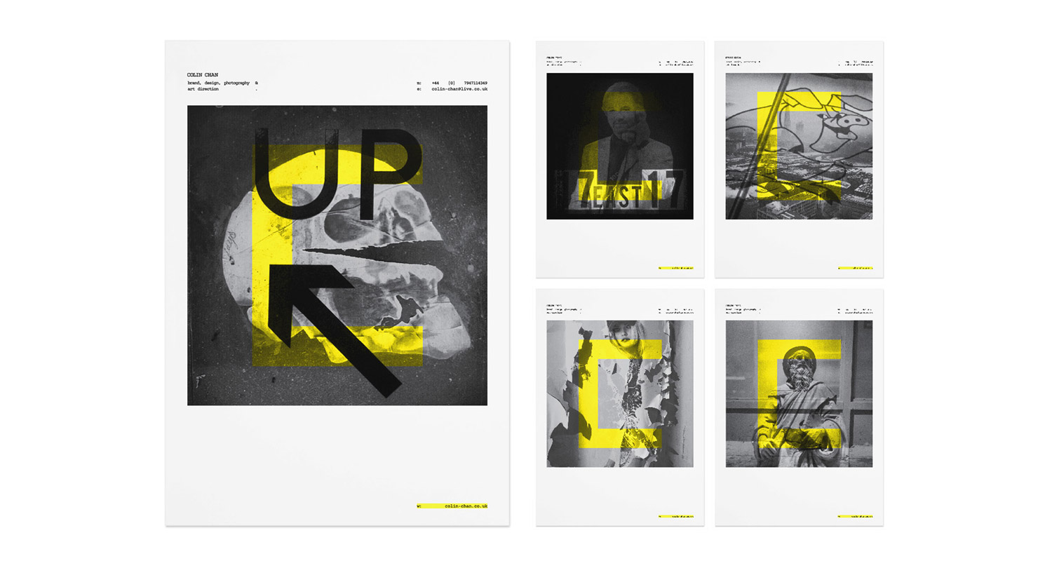
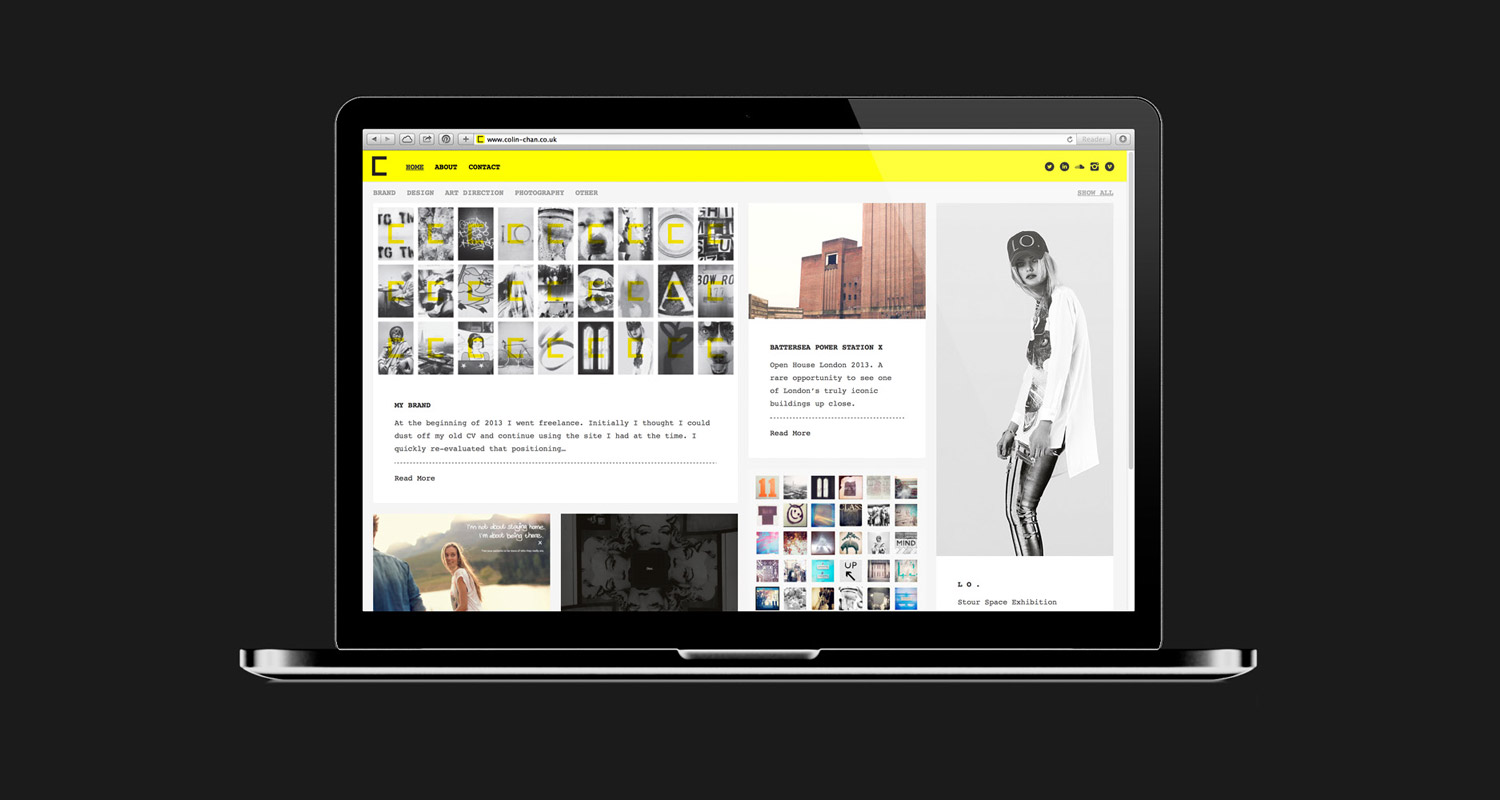
At the beginning of 2013 I went self employed. Initially I thought to dust off my old CV and continue using the site I had at the time. I quickly re-evaluated that thinking…


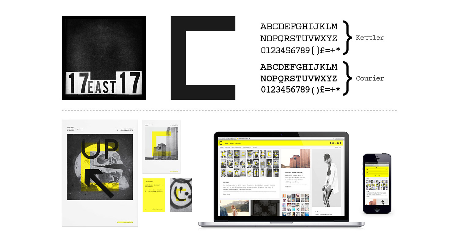
I needed to rebrand. It had to be a shining example of the kind of brand work that I wanted to help others with in the future. Over the years I’ve navigated my way through the creative department, starting as a Junior Designer, moving through to Art Director and now work with brands. I’ve developed considerably as a designer over the years, photography and typography have come along for the ride, and then there’s strategy. Strategy is now an intrinsic part of everything I do. So why didn’t I have one? Good question.


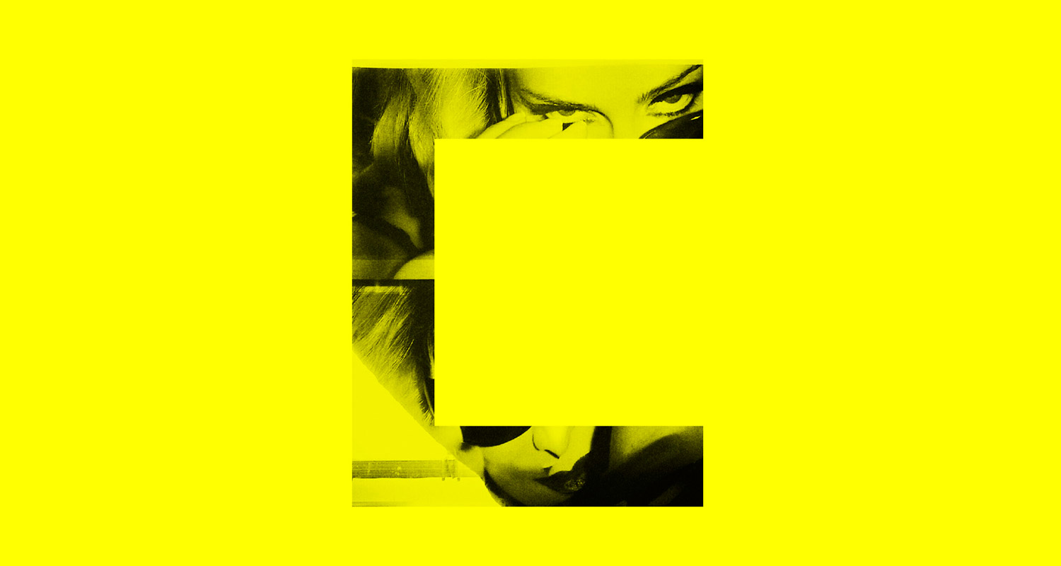
This wasn’t a time to compromise. This was a time to create the brand that I’d always wanted. Branding is so much more than the way you look, it’s about who you are and what you stand for. Why should someone choose to work with you? What can you offer them that’s unique? Why should they believe in you? This set of core values needs to come across in everything you do, from the way you conduct business on a daily basis to your website + everything in-between. Easy to say, not so easy to do.


My core values were straight forward. I’m dedicated to art and design and have been for as long as I can remember – I’m in it for the long haul. I’m single minded in my approach and will pursue what I consider to be the best solution doggedly until it accepts defeat. I love what I do and I’m passionate about doing it.


Tone of voice needed to be natural, I should be myself. Try to be direct but accommodating and inject some of my dry sense of humour – dry being the operative word.

Stage 1

Before the days of smartphones and Instagram, I used to carry a Canon Ixus around. More recently, my choice of mobile phone was heavily influenced by the quality of the camera it came with – the best camera being the one you have with you. I wanted my brand imagery to give the viewer an incite into who I am as a designer. By using snapshots that I’d taken over the years, I felt it gave the perfect window into what inspires me creatively.

Stage 2

Next I needed to look at a symbol, colour scheme and typography. The ‘C’ symbol was simple. Well, that’s what I wanted it to be. No fuss, just a easily identifiable stamp that I could apply to anything and everything.


A good friend and colleague once told me that you should never use yellow in your design as it reminds people of urine. Fair enough. Although I’m not sure I entirely agree. Yellow is however notoriously difficult to use in design as it’s hard to read when used in typography. On the flip side, it’s bright, inspiring and comes in a Pantone fluorescent – which is quite literally, brilliant. My origins come from print and I wanted that to come through. For those reasons I decided to only use yellow as an overlay or background colour. I’d get the vibrancy I needed without compromising on readability.


Structurally speaking, I’m a big fan of Josef Müller-Brockmann. I also read once that Non-Format had used the labelling on boxes as an inspiration for their layout. It makes sense. Information is given prominence in order of what’s most important. For example, in some cases the name is not actually as important as the weight. I worked in a warehouse that sold flat packed furniture one summer and had plenty of time to test this theory out.


Typographically I wanted something functional that reminded people of typographic craftsmanship – when people took time putting words together. I went for Kettler as it pays tribute to Howard Kettler’s classic, Courier, and has some unusual letter shapes that I like. I went for the original as a secondary option for online use. Text in black or grey, no messing about.

Now for the simple task of designing a website…


I’d just finished a project that involved usability testing and was keen to incorporate some of that thinking. Like on the box label, it made sense to prioritise the information in order of importance. Imagery is also key. I wanted people to arrive at the home page and immediately understand who I am as a designer / photographer. I wanted people with more time to have the opportunity to explore + I needed a way for visitors to refine search criteria if they were in a rush. So, primary navigation has Home, About, Contact and social media icons. Secondary navigation is broken down into my four main disciplines, plus an ‘Other’ tab to catch everything else. That a was that. In the absence of a digital department, I found a theme that suited my requirements, a solid developer to customise it, hosted with Laughing Squid and used WordPress for my CMS.


I once met a recruitment consultant who, after half an hour of me presenting my portfolio, questioned whether all the work was my own. I understand, people like to pigeonhole you. Hopefully my new site would go part way to setting the record straight.

Date

December 8, 2014

Category

Branding, Graphic Design, Web Design